Design Culture
Read This If You Can: The Designers Who Made Legibility the Enemy
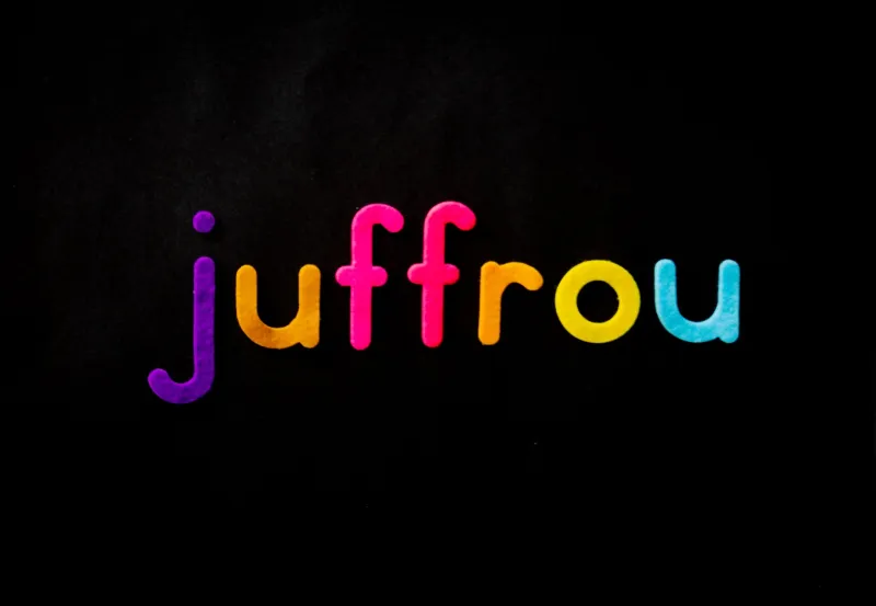
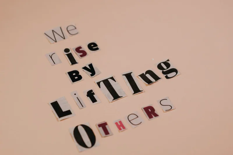
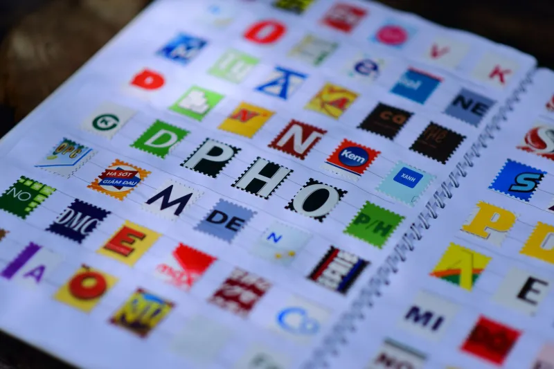
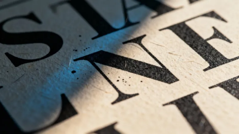
A new wave of experimental designers is creating typefaces that actively fight back against being read. It sounds like a joke. It isn't. And once you understand why, you might never look at clean, readable text the same way again.