A Is for Amber, B Is for Bruise: The Synesthetes Rewiring American Typography
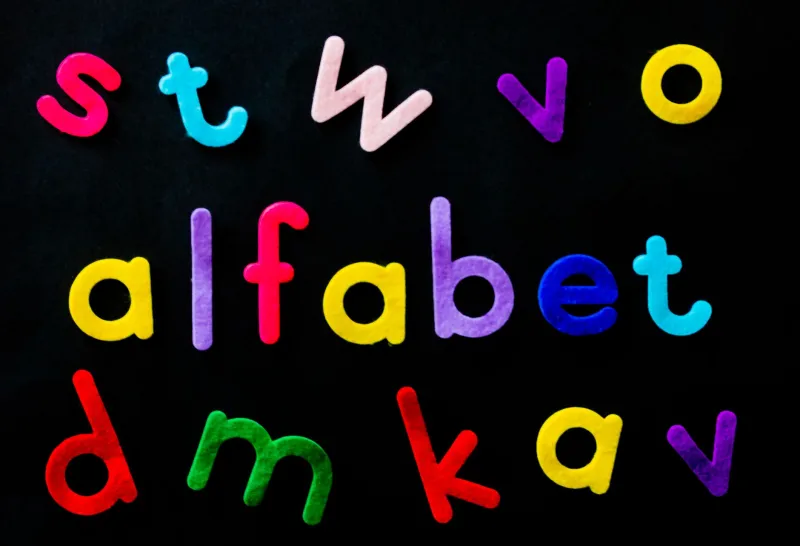
Somewhere in a studio in Portland, a typographer named Devin is having an argument with the letter G. Not about its form — the curves are fine, the weight is acceptable — but about its color. To Devin, G is unambiguously a warm, slightly dusty yellow-green. The client wants it rendered in navy. This is not going well.
Devin has grapheme-color synesthesia, a neurological condition in which letters and numbers reliably trigger the perception of specific colors. Not as metaphor. Not as mood. As actual, involuntary sensation. For roughly four percent of the population, the alphabet isn't a neutral set of symbols. It's a full sensory landscape, complete with hues, textures, and — if you ask certain synesthetes — distinct emotional temperatures.
And increasingly, those people are designing the fonts you use every day.
The Brain That Sees in Letters
Synesthesia as a concept has been kicking around scientific literature since the 19th century, but its mainstream cultural moment arrived somewhere between the publication of Richard Cytowic's The Man Who Tasted Shapes and the internet's collective obsession with personality quizzes. Grapheme-color synesthesia is one of its most common forms — researchers at MIT and Caltech have spent years mapping the neural cross-activation between the brain's letter-recognition regions and its color-processing centers.
What makes the condition particularly relevant to design is its consistency. Ask a synesthete what color the letter A is today, and ask again in twenty years. You'll get the same answer. The associations aren't random or shifting — they're hardwired, personal, and stubbornly resistant to outside influence. This is either a gift or a professional liability, depending on whether your client needs the logo in red.
"A has always been red for me, which is convenient exactly once and inconvenient constantly," says one New York-based brand designer who asked to be identified only as Margaux. "Every time I have to design a wordmark that starts with A in a cool blue palette, my brain is basically filing a formal complaint."
When the Alphabet Has Opinions
The intersection of synesthesia and typography isn't new — Vladimir Nabokov famously catalogued his letter-color associations in Speak, Memory, describing them with the obsessive precision of a man who understood that nobody would believe him but couldn't stop talking about it anyway. What's newer is the growing community of synesthetic designers who are choosing to let those involuntary perceptions guide creative decisions rather than suppress them.
At the heart of this movement is a philosophical question that would feel right at home on this very website: if letters already have inherent qualities — weight, rhythm, voice — why not color? Why not texture? Why not the particular emotional charge that makes the letter S feel slippery and the letter D feel blunt and dependable?
Several American type foundries have begun quietly consulting synesthetic designers during the development phase of new typefaces, not to dictate color palettes but to stress-test personality. If a font is meant to feel authoritative, does the letterform of the M carry weight? Does the E feel open or closed off? Synesthetes, it turns out, have strong opinions about letterform personality that often align with how non-synesthetic audiences emotionally receive type — they've just been experiencing it in higher resolution all along.
Branding at the Frequency of Perception
The branding industry has always known, on some instinctive level, that letters carry emotional freight. That's why certain luxury brands favor thin serifs and certain fast-food chains favor rounded, approachable letterforms. Synesthetic designers are now pushing this intuition into more explicit, more defensible territory.
A small but growing number of American branding studios are marketing what they call "chromatic typography" — typeface and color system pairings developed in consultation with synesthetic designers, meant to create a kind of neurological coherence between letterform and hue. The idea is that when the color of a brand's wordmark aligns with the "correct" color of its letters according to synesthetic perception, something clicks more deeply in the viewer's brain, even for non-synesthetes.
Is there peer-reviewed evidence for this? The research is preliminary at best, enthusiastically speculative at worst. But the studios doing it are getting clients, and the clients are reporting that their rebrand feels "right" in ways they can't fully articulate. Which is, frankly, how most branding has always worked.
The Texture Problem
Color gets most of the attention, but synesthetic designers are equally obsessed with what they describe as the texture of letters. Some experience certain typefaces as rough, others as waxy, others as having the specific tactile quality of wet sand. This dimension of synesthetic perception has found its most natural home in editorial and packaging design, where the relationship between printed material and physical sensation is already part of the conversation.
A Chicago-based packaging designer named Theo describes choosing typefaces for food brands partly based on whether the letterforms "feel" like the product. "There's a granola brand I worked with where the brief said warm, rustic, handcrafted," he explains. "I kept gravitating toward a particular slab serif because the letters felt slightly rough to me, like the surface of oats. The client never knew that was part of my process. They just said it felt authentic."
This is the quiet way synesthetic perception is entering mainstream American design — not through manifestos or academic papers but through individual designers trusting their involuntary sensory data and finding that it produces results other people respond to.
Teaching the Rest of Us to Taste
Perhaps the most interesting development is the emergence of synesthesia-inspired design education. A handful of American art schools, including programs at RISD and CalArts, have begun incorporating exercises that ask non-synesthetic students to assign sensory qualities to letterforms — not because they'll experience them that way, but because the discipline of thinking about type as multisensory sharpens their formal instincts.
The goal isn't to simulate a neurological condition. It's to disrupt the habit of treating letters as purely visual, purely neutral, purely functional. The alphabet, ABCDF∞ would argue, has never been any of those things. It has always been a system loaded with personality, history, and sensation. Some people just have better reception.
For Devin, still negotiating with the client about that G, the broader cultural shift is validating but also slightly beside the point. "I don't need the design world to accept synesthesia as a methodology," he says. "I just need them to accept that G is not navy. G has never been navy. Navy is for N, obviously."
N, for the record, disagrees.