Ghost Fonts: The Slow Disappearance of America's Hand-Painted Words
Ghost Fonts: The Slow Disappearance of America's Hand-Painted Words
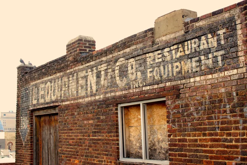
Somewhere in Rust Belt Ohio, the word "HARDWARE" is still visible on the side of a building, if you know where to look and the afternoon light hits the brick at precisely the right angle. The H is fully gone. The W is half a letter. The rest is a kind of typographic Morse code — presence, absence, presence, absence — spelling out a business that shuttered sometime in the 1970s and has been slowly unspelling itself ever since.
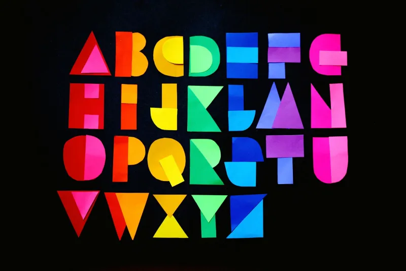
This is what ABCDF∞ was made for. Not the clean, finished, properly kerned letter. The dying one.
What Ghost Lettering Actually Is (And Why It Matters)
The technical term is "ghost sign," and it refers to any painted advertisement or signage on a building exterior that has faded, partially disappeared, or been painted over — often multiple times — leaving a layered, semi-legible palimpsest of commercial history. The United States is covered in them. Brick walls in Cincinnati, Chicago, Baltimore, and Birmingham carry decades of painted messages in various states of dissolution, each layer whispering through the next like bad audio bleed on a cassette tape.
Sign painters — the actual human beings who climbed ladders with brushes and buckets and painted letterforms directly onto building exteriors — were a dominant professional class in America from roughly the Civil War era through the mid-20th century. Their work was never intended to be permanent. It was advertising. It was functional. It was, in the taxonomy of cultural production, completely disposable.
And then the sign painters largely disappeared, replaced first by printed vinyl and then by LED screens, and suddenly their disposable work became the most irreplaceable visual record of how American commercial life used to look, feel, and spell itself.
The Photographers Who Chase Fading Letters
Frank Jump has been photographing ghost signs since 1992. His ongoing project, Fading Ads, has accumulated thousands of images from across the country — a visual archive of letters in the act of leaving. His photographs are less about the buildings than about the specific quality of absence: the ghost of a serif, the memory of a drop shadow, the place where a letter used to be confident and is now just a rumor.
"There's a moment," Jump told Atlas Obscura in an interview, "when a sign is faded enough to be beautiful but not so faded that it's gone. I'm always chasing that moment."
That moment is, in ABCDF∞ terms, the letter at the edge of the alphabet. The one that might or might not be there. The one the eye and the brain negotiate over.
Urban photographer Greta Rybus has documented similar phenomena in the Pacific Northwest, where the combination of rain, moss, and economic contraction has produced ghost signs of particular atmospheric intensity. In her images, letters don't so much fade as dissolve into the organic texture of the wall itself — becoming less typography and more geology. The sign for a long-closed fishery in Astoria, Oregon, in one of her photographs, looks less like a commercial message and more like a fossil.
What the Letters Say When They're Half Gone
Here's the thing about a ghost sign: partial legibility is more interesting than full legibility, and full absence is more interesting than either. A complete, pristine sign tells you one thing. A half-erased sign tells you two things simultaneously — what was there and what time does to what's there — and the tension between those two messages is where the actual meaning lives.
Urban historian Andrew Hurley, whose book Beyond Preservation examines how communities use physical artifacts to construct historical memory, has written about commercial signage as an unintentional documentary record. "Nobody painted a drug store sign on a wall in 1923 thinking 'future historians will want this,'" he's noted. "They painted it to sell aspirin. The historical value is entirely accidental, which is part of what makes it authentic."
The accident is the archive.
In Detroit, where economic contraction has left entire neighborhoods in various states of structural abandonment, ghost signs have become a kind of alternative historical record — one that documents the city's commercial geography in ways that official municipal records often don't. A faded sign for a Black-owned insurance company on the east side tells you something about the neighborhood's mid-century prosperity that no Wikipedia entry does. The letter is doing historical work. It just didn't know it was going to.
The Economics of Disappearance
Ghost signs don't appear randomly. They cluster in places that have experienced economic disruption — former industrial corridors, post-redlining neighborhoods, small towns bypassed by the interstate system in the 1960s, commercial strips that never recovered from the arrival of big-box retail in the 1990s. The map of America's ghost signs is also, more or less, a map of America's economic losses.
In many cases, the signs survive precisely because nothing replaced them. A thriving economy paints over the past. A struggling one can't afford to.
This gives ghost lettering a complicated political texture that its photographers and archivists are careful to acknowledge. Documenting a beautiful faded sign in a neighborhood that has been systematically disinvested is not a neutral act. The beauty is real. So is what caused it.
The Virginia-based preservation group Vanishing Georgia has been wrestling with exactly this tension, documenting ghost signs across the state while simultaneously advocating for the economic revitalization of the communities that host them. "We don't want these places to stay beautiful ruins," one organizer told a regional newspaper. "We're documenting them because we're losing them, and we'd rather not be losing them."
The Art of the Eroding Glyph
Meanwhile, some artists have decided to lean all the way into the decay rather than racing to preserve against it.
New York-based artist Candy Chang — best known for her participatory public art projects — has talked about how the impermanence of painted text in public space is itself a medium. The fact that a letter will fade is part of what it means. Permanence is a design choice. So is ephemerality.
Several contemporary sign painters have begun intentionally creating work designed to weather and fade — not as vandalism, but as a deliberate aesthetic and conceptual choice. They're making ghost signs on purpose, compressing the 50-year decay process into an intentional artistic statement about impermanence, memory, and the strange afterlife of letters.
Which is, when you think about it, exactly the kind of move ABCDF∞ respects. The alphabet skipped from E to G and kept going. The ghost sign skips from legible to illegible and keeps meaning things.
The Last Letter
In typography, there's a concept called a "widow" — a single word or short line left alone at the top of a page, orphaned from the paragraph it belongs to. Ghost signs are the architectural equivalent: single surviving letters, half-words, phantom serifs, clinging to walls long after the sentences they belonged to have dissolved.
They are, in the most literal possible sense, letters unbound.
The H from that Ohio hardware store is gone. But the wall remembers where it was. And if you stand in the right place at the right time of day, you can almost read it — the ghost of a letter, which is to say, a letter still doing its job.