Scissors, Glue, and Chaos: The Radical Typography America Keeps Trying to Forget
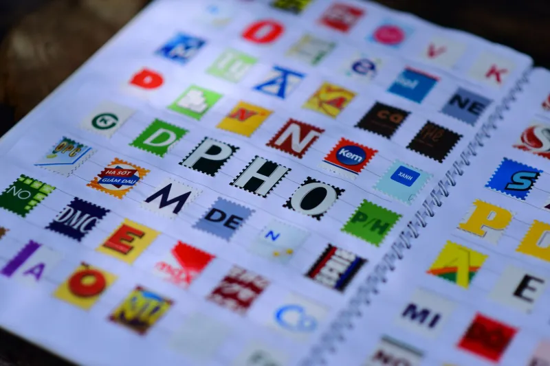
There is a particular kind of letter that makes your brain do something uncomfortable. It doesn't sit still. It refuses to commit to a single font, a single size, a single emotional register. One word might be screaming in 72-point bold serif and the next word is whispering in a thin italic clipped from a furniture catalog. Your eye doesn't glide — it stumbles, catches, recalibrates. That's not a bug. That's the whole point.
We're talking about the ransom note. And we're here to argue it's the most honest alphabet America has ever produced.
The Criminal Origins of a Visual Language
The cut-and-paste letter has a genuinely dark origin story, and it would be dishonest to skip past that. Kidnappers, extortionists, and anonymous threat-writers turned to clipped letterforms for a simple practical reason: handwriting could be traced, typewriters could be matched to specific machines, but a letter assembled from fifty different publications belonged to no one. The aesthetic was born from the desire to disappear.
What's strange — and deeply American — is what happened next. The visual grammar of anonymity got loose. It escaped the criminal context entirely and landed somewhere nobody expected: the margins of culture, where people had things to say and no sanctioned platform to say them from.
By the mid-1970s, that same fragmented, collaged letterform was showing up on punk flyers stapled to telephone poles in lower Manhattan and the back alleys of Los Angeles. The message changed completely. Instead of give us the money or else, it became something closer to the system is lying to you and we made this in a basement and we don't care if it looks polished. The chaos wasn't a limitation. It was the content.
Zines, Xerox Machines, and the Democratization of the Alphabet
American underground publishing in the late seventies and eighties ran almost entirely on cut letters, rubber cement, and photocopier toner. Zine culture — that magnificent, sprawling, thoroughly ungovernable ecosystem of self-published newsletters, music reviews, political manifestos, and absurdist fiction — adopted the ransom note aesthetic as something close to a philosophical position.
If you couldn't afford typesetting, you grabbed a magazine. If you didn't have access to a design studio, you used your kitchen table. The mismatched letters weren't an apology for a lack of resources. They were a declaration that the resources didn't matter. Riot Grrrl zines out of Olympia, Washington, hardcore show flyers from Washington D.C., anti-corporate pamphlets distributed outside shopping malls in the midwest — all of them used collaged type as a kind of visual shorthand for we made this ourselves and you should too.
There's a reason the alphabet has always been political. Letters are how power writes itself down. Cut those letters out of context — literally cut them out, with scissors, from the magazines that sold you the dream — and you've already committed a small act of subversion before you've said a single word.
The Digital Simulation Problem
Here's where things get complicated. Somewhere around the late 1990s and early 2000s, graphic designers noticed that the ransom note look was striking, arresting, and commercially useful. Fonts arrived that mimicked the aesthetic — uneven baselines, mismatched weights, the visual texture of cut paper — without requiring anyone to actually cut anything. You could download the chaos. You could apply it in three clicks.
And something was lost, even if it's hard to articulate exactly what.
The digital ransom note font is a costume. It wears the visual language of anonymity and urgency without the conditions that produced those qualities. An algorithm cannot be anonymous. A font file cannot be desperate. When a fast-food chain uses a cut-letter aesthetic to sell limited-edition packaging, it is borrowing the signifiers of underground resistance to move product, which is — to use a technical term — extremely funny in a way that makes you want to lie down on the floor.
This isn't a new problem. Every subversive visual language eventually gets absorbed. But the absorption happens faster now, and it hollows things out more completely, and it leaves the people who cared about the original thing feeling like they're holding an empty jar.
The Hands Coming Back
Which is exactly why a small but genuinely passionate community of American artists and designers has returned to the physical practice. Not as nostalgia. Not as irony. As a considered choice about what kind of letters they want to make and what those letters cost.
In Philadelphia, collage artist and zine-maker Dara Osei-Mensah has been producing hand-cut political broadsheets for the better part of a decade, sourcing her letters exclusively from publications she finds at thrift stores and estate sales. The result is typography that is technically ransom note and spiritually something else entirely — a kind of archaeological record of what Americans were reading and buying and believing in the years before each piece was assembled. Every letter carries a ghost.
In Portland, a collective called Wrong Margins runs irregular workshops teaching participants to build type from physical materials. The rule is no digital tools, no fonts, no shortcuts. Participants report that the slowness is the revelation. When you have to find the letter Q — always the letter Q, the stubborn, underrepresented letter Q — you develop a relationship with the alphabet that screen-based design simply does not offer.
And across the country, a loose network of protest artists has returned to hand-cut letters for demonstration signage, arguing that the visual language of collaged type communicates something that a clean, printed banner does not: that this was made by a person, under conditions of urgency, with whatever was available.
What the Mismatched Letter Actually Says
Here at ABCDF∞, we have a particular investment in the idea that letters are not neutral. The alphabet is not a transparent delivery system for meaning — it is meaning, carrying its own history, its own politics, its own aesthetic commitments in every curve and serif and awkward angle. Our whole thing is that the letters themselves matter as much as what they spell.
The ransom note aesthetic, at its best, makes that argument visible. It forces you to look at the letter before you read the word. It refuses the seamlessness that most typography strives for, the invisibility that conventional design considers a virtue. A cut letter says: I was somewhere else before I was here. I was in a different context, serving a different purpose, and someone took me out of that context deliberately, and that act of removal is part of what I mean now.
In an era of algorithmic font selection, AI-generated design assets, and visual content produced at a scale that makes individual authorship nearly meaningless, there is something genuinely radical about a letter that still has scissors marks on it.
The ransom note was never really about the ransom. It was about what happens when you refuse to use the alphabet the way you were handed it — when you take the letters apart and put them back together wrong, on purpose, because the right way was never yours to begin with.
That's not a criminal act. That's the whole project.