Period. Full Stop. Revolution: The Tiny Marks Staging America's Quietest Uprising
Period. Full Stop. Revolution: The Tiny Marks Staging America's Quietest Uprising
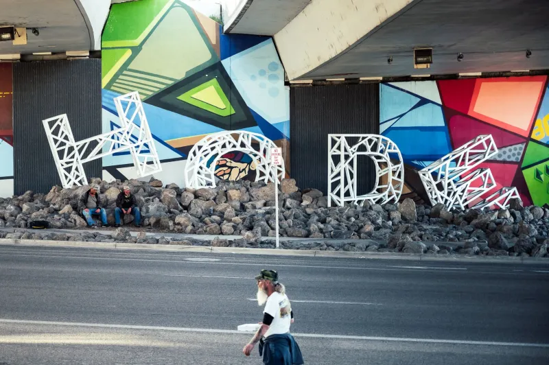
There is a comma spray-painted on a retaining wall in East Nashville. It is roughly the size of a dinner plate, rendered in cautious burgundy, and it means absolutely nothing — grammatically speaking. No sentence precedes it. No clause follows. It just sits there, curved and confident, like a tiny fist raised against the void.
The person who put it there goes by the handle ,LUDE (pronounced, presumably, however you want). In a city drowning in guitar-shaped neon and boot-shaped branding, a lone comma on a concrete wall is, somehow, the most interesting thing for three blocks in any direction.
Welcome to the punctuation rebellion. It is small. It is pedantic. It is absolutely losing its mind.
The Mark That Got Left Behind
Here is the thing about punctuation that nobody tells you in school: these marks were never really about grammar. They were about breath. Early manuscripts used dots and slashes to tell monks where to pause when reading scripture aloud. The comma, the period, the colon — they were stage directions for the human voice, not rules handed down by a divine copy editor.
Somewhere along the way, we forgot that. Punctuation became the property of correctness, of red pens and standardized tests and the particular cruelty of being told your sentence is a fragment. It stopped being a tool and became a verdict.
Which is exactly why artists started stealing it back.
"The comma is the most human mark in the language," says Renata Iglesias, a Chicago-based typographic installation artist whose recent show Pause/Insurgency filled a former meatpacking warehouse with nothing but oversized punctuation marks suspended from the ceiling at irregular intervals. "It says: I'm not done. There is more. Hold on. That's not a grammar lesson. That's a survival strategy."
The show sold out its run. The gift shop moved three hundred tote bags printed with a single, enormous comma. People wept, apparently. In front of punctuation.
The Apostrophe Provocateurs
If the comma is the philosopher of the rebellion, the apostrophe is its chaos agent.
A loose collective of designers and street artists operating out of Portland, Oregon — they call themselves Its/It's, which is either extremely clever or aggressively irritating depending on your tolerance for wordplay — have spent the better part of three years inserting rogue apostrophes into corporate signage across the Pacific Northwest. A regional grocery chain's logo briefly became possessive in a way that implied the store owned all of America's vegetables. A bank's ATM vestibule was rebranded, temporarily, as belonging to someone named Dave.
The interventions are small enough to pass unnoticed by most, significant enough to make a graphic designer physically ill. That tension, the group argues, is the entire point.
"Corporations spend millions making their logos feel permanent and authoritative," says one member, identified only as K-- (note the em dash, a choice they made deliberately and will absolutely make you ask about). "One apostrophe and suddenly the whole thing looks like a typo. It looks human. That terrifies them."
It does, a little. Several of the targeted companies have issued cease-and-desist letters. One sent a very long email about brand integrity. Its/It's framed it. The apostrophe, it turns out, has real legal consequences when applied without consent to someone else's trademark. Nobody told the monks.
Ellipses and the Art of Not Finishing
Meanwhile, in the experimental writing community, the ellipsis is having what can only be described as a moment...
Authors like Deja Fontaine, whose debut novel Trailing Off was published by a micro-press in Brooklyn and consists almost entirely of incomplete sentences terminated by ellipses, are using the mark not as a gesture of uncertainty but as a deliberate structural choice. The ellipsis, in Fontaine's hands, is not weakness. It is an open door.
"Every sentence I leave unfinished is an invitation," Fontaine explained in an interview that she ended, magnificently, mid-sentence. "The reader has to complete it, which means the reader has to reckon with their own assumptions about where language is supposed to go. That's not a stylistic quirk. That's..."
The interview transcript ends there. Whether intentionally or not remains unclear. Fontaine has not clarified. The publisher says this is "on brand."
Academic reception has been predictably divided. Half of the reviews call Trailing Off a masterwork of post-structural narrative. The other half call it a proofreading disaster. Fontaine has framed both sets of reviews. They hang side by side above her desk in a gesture that functions, itself, as a kind of punctuation — the dash between two opposing ideas that somehow coexist.
The Em Dash Maximalists
Spoken of dashes: the em dash has become the unofficial punctuation of American graphic design's most confrontational wing, and nobody is entirely sure how it happened.
Walk through any serious design show in New York, LA, or the increasingly art-saturated corridors of Detroit's reclaimed industrial spaces, and you will encounter the em dash deployed with the frequency and aggression of a power chord. Poster series built entirely around it. Zines that use it as a structural element, a divider, a weapon. One designer — Marcelline Osei, whose work appears regularly in galleries that describe themselves as "post-legibility," which is a real category of gallery now — uses the em dash exclusively as her signature, in place of her name.
"The em dash interrupts," Osei says. "It barges in. It says: wait, actually — and then it refuses to fully resolve. That is the most honest description of how I move through the world that I have ever found."
The mark is also, she notes, the one most consistently misused in digital communication, frequently replaced by two hyphens by people whose keyboards lack the character. The gap between what the mark is and what it gets reduced to — that degradation, that substitution — is itself a kind of cultural text worth reading.
What the Rebellion Is Actually About
Strip away the gallery statements and the zine manifestos and the very committed apostrophe criminals, and the punctuation rebellion is about something fairly simple: who gets to control meaning.
For most of American history, the rules of written language were enforced by institutions — schools, publishers, newspapers, style guides handed down with the solemnity of religious texts. The comma went where you were told. The period ended what you were told it ended. Deviation was error. Error was failure.
The internet cracked that open, and not always in flattering ways. But in the wreckage of collapsing grammatical authority, artists found something genuinely useful: the marks themselves, freed from their rules, available for repurposing.
A comma on a wall in Nashville isn't a mistake. It's a pause in a sentence the city hasn't written yet. An apostrophe on a bank logo isn't vandalism — or, well, legally it might be, but artistically it's a question mark wearing a disguise. An ellipsis at the end of a novel chapter isn't the author giving up. It's the author handing you the pen.
At ABCDF∞, we have always operated on the premise that the alphabet is not finished — that somewhere between F and G, between the letters everyone agreed on and the infinite characters that didn't make the cut, there is a space where meaning gets made on its own terms.
Punctuation lives in that space. Always has.
The rebellion isn't new. It's just finally loud enough to hear.
,