Nobody Taught Them Helvetica and That's Exactly the Point
Nobody Taught Them Helvetica and That's Exactly the Point
There is a sign on a two-lane road outside Eutaw, Alabama, that has been advertising boiled peanuts since approximately the Clinton administration. The letters are not the same height. The "N" leans like it had a long weekend. The color — a shade somewhere between school-bus yellow and existential dread — was almost certainly mixed from leftover house paint. It is, by every measurable standard of formal typography, a disaster. It is also, without question, the most compelling piece of lettering within a forty-mile radius.
This is not a coincidence.
The Alphabet Has Always Had a Country Cousin
American design culture loves to celebrate the vernacular — right up until the vernacular shows up uninvited and starts rearranging the furniture. For decades, roadside signs made by farmers, preachers, produce vendors, and small-town entrepreneurs have constituted an enormous, entirely unself-conscious folk art movement that stretches from the Florida panhandle to the Oregon coast. Nobody commissioned it. Nobody curated it. It just grew, the way kudzu grows, and now it covers everything.
The letters themselves are the story. Without access to professional stencils, vinyl cutters, or the accumulated wisdom of a design education, amateur sign-makers develop what researchers in vernacular typography — yes, that is a real field, and yes, those people are having a better time than you — call hyper-local visual dialects. The way a particular painter in rural Tennessee serifs every capital letter because it feels more official. The way a church marquee in eastern New Mexico squeezes its letters together at the end of a line because the message turned out longer than the board. These aren't mistakes. They're solutions. And collectively, they form a visual language as specific and readable as any regional accent.
Meet the People Actually Doing This
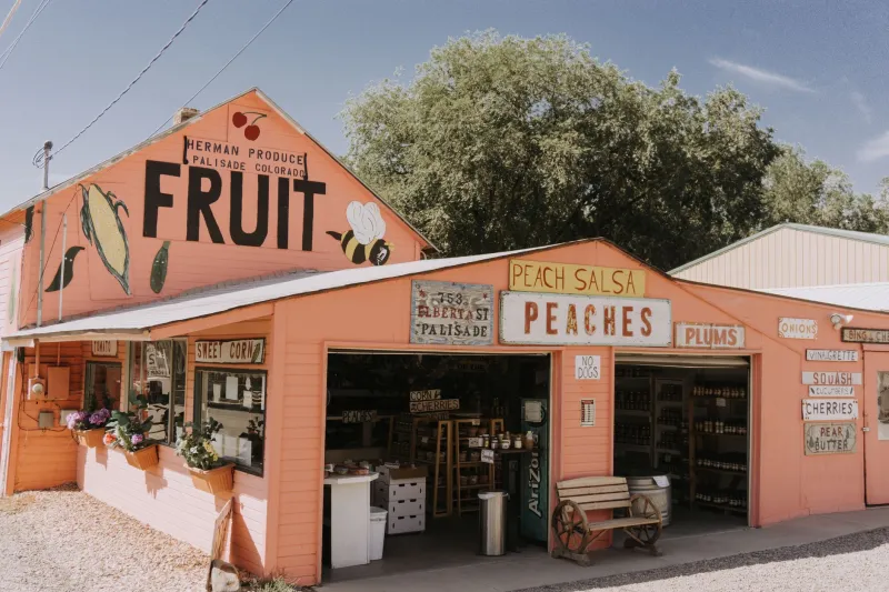
Dorothy Fugate has been painting signs for the Fugate Family Farm Stand in Grayson County, Virginia, since her husband's knees gave out and she inherited the roadside advertising duties along with the tomato inventory. She uses a set of brushes her father-in-law bought in 1971 and mixes her own colors from a mental formula she cannot fully articulate. "I just know what looks right," she says, in the way that people who are genuinely good at something always describe the thing they're genuinely good at.
Her letters are wide, confident, and slightly italicized — not because she learned italic, but because painting fast on a windy hillside naturally pushes the stroke forward. Her signs are landmarks. Locals give directions using them. "Turn left at Dorothy's peach sign" is a navigational instruction that has guided more people to their destinations than several GPS coordinates we could name.
Three states west, in a small Missouri town that prefers not to be identified by name for reasons involving a local dispute over a tractor, there is a man who paints church signs and refuses to be photographed. His specialty is the kind of pun-heavy inspirational message that lives rent-free in your brain for a week — "CH RCH: What's Missing? UR" — but his real genius is spatial. He treats the marquee as a fixed grid and works backward from the punchline, so every letter earns its place. He learned this from no one. He invented it out of necessity and stubbornness, which is how most great typographic systems actually get invented, if we're being honest.
When the Letter Bends, the Community Holds
Here is the part that design culture keeps missing when it occasionally notices these signs and makes appreciative noises about authenticity: the signs are not just signs. They are landmarks of identity in a way that professionally produced signage structurally cannot be. A vinyl banner from an online print shop looks exactly like a vinyl banner from an online print shop in every town in America simultaneously. Dorothy's peach sign looks like Dorothy's peach sign, which looks like Grayson County, Virginia, which looks like a specific patch of the world that specific people call home.
When a beloved sign deteriorates and the community rallies to have it repainted — which happens more than you'd think, and is one of the more quietly moving things happening in rural America right now — what they're preserving isn't just information about where to buy corn. They're preserving a letterform that belongs to their place the way a dialect belongs to a region. The idiosyncratic "G" that's always looked a little like a fish. The drop shadow that's more enthusiastic than accurate. These are not flaws being tolerated. They are features being protected.
What Design School Could Learn (But Probably Won't)
The irony is thick enough to spread on toast: the principles that make these signs work — visual hierarchy built from constraint, personality derived from material honesty, letterforms shaped by the actual human hand holding the actual physical brush — are the same principles that every serious design education claims to teach. The difference is that Dorothy Fugate learned them by painting signs on a windy hillside in Virginia, and the tuition was zero.
There's something in the ABCDF∞ spirit here — the idea that the alphabet is not a closed system handed down from on high, but a living, bending, arguing thing that different people use differently and that's exactly what makes it worth using. The formal design world spent most of the twentieth century trying to standardize letterforms into universal systems. Rural America spent the same century quietly ignoring that project and making signs that told you exactly where you were.
Neither side is wrong. But only one of them will tell you where to find the boiled peanuts.
The Road Is the Gallery
There is no institution preserving most of this work. The Smithsonian has taken some interest. A handful of regional folk art organizations photograph signs before they're replaced. Some academics are doing important, underfunded work documenting what they can. But mostly, these signs exist in the way all genuinely local things exist: fully, specifically, in a particular place, for the people who live there, until they don't anymore.
Which means the only real way to see this art is to drive the roads where it lives. Take the state routes. Get off the interstates, which are design deserts of standardized signage and corporate uniformity. Look for the hand-painted letters. Look for the ones that lean, the ones that crowd, the ones that substitute a numeral for a letter because the sign-maker ran out of the right piece of wood. Look for the ones that have been repainted so many times that the layers of old messages ghost through the new one like a palimpsest, like a letter written over a letter written over a letter.
That's the American alphabet nobody designed. It's been out there the whole time, waiting to be read.