Fonts That Died With Their Era: The Race to Rescue America's Extinct Typefaces
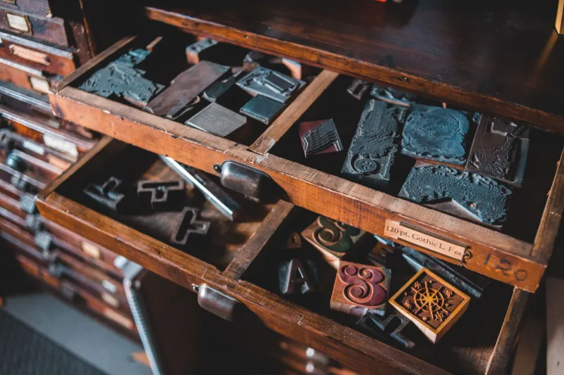
In a storage unit in Cincinnati, there are approximately 400 pounds of metal type that nobody under 60 knows how to set. The drawers are labeled in a system that made perfect sense to the man who organized them in 1971 and makes no sense to anyone who has encountered them since. The man died in 2019. The storage unit is paid up through the end of the year. After that, the math gets uncomfortable.
This is not an unusual situation. Across the United States, in print shops that survived past their natural expiration date, in university archives that haven't been catalogued since the Carter administration, in the attics of families who inherited equipment nobody knew how to use or throw away, there are typefaces that have no digital existence. Faces that shaped how American commerce, culture, and communication looked for decades — and that are now one estate sale away from permanent oblivion.
A Visual History Nobody Thought to Save
The problem with typefaces, as historical artifacts, is that they were always considered tools rather than objects of cultural significance. Nobody archived the hammer when the nail gun arrived. When phototypesetting replaced hot metal in the 1960s and 70s, and when desktop publishing then replaced phototypesetting in the 80s and 90s, each transition left behind entire visual vocabularies that simply weren't worth digitizing at the time.
"The transitions happened fast and they happened commercially," explains Harriet, a type historian based in Chicago who has been documenting endangered American typefaces for nearly a decade. "Foundries converted their bestsellers. The fonts that paid the bills got saved. Everything else — the display faces, the novelty types, the stuff that was deeply regional or specific to one industry — just didn't make the cut."
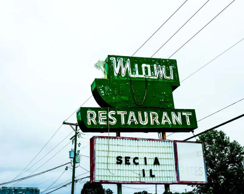
What got left behind is, in retrospect, a remarkably specific portrait of American visual culture at particular moments in time. The heavy ornamental wood type that covered the facades of 19th-century American main streets. The bold, optimistic display faces of the New Deal era, designed to convey confidence to a country that badly needed some. The sleek, vaguely futuristic corporate lettering of the 1950s and 60s, when America was absolutely certain it was going to the moon and wanted its signage to reflect that ambition.
The Victorian Explosion and Its Casualties
No era produced more typographic variety — or lost more of it — than the Victorian period. Between roughly 1850 and 1900, American type foundries were in an arms race of decorative excess, producing fonts with names like French Clarendon, Tuscan Antique, and an entire taxonomy of faces that featured inline strokes, shadow effects, and ornamentation that modern designers look at with a mixture of admiration and mild anxiety.
Many of these faces survived into the 20th century in wood type form — oversized versions used for posters and handbills, where the scale made metal impractical. The Hamilton Wood Type & Printing Museum in Two Rivers, Wisconsin, holds one of the most significant collections of surviving wood type in the country, and its ongoing digitization project has already rescued dozens of faces from practical extinction.
But for every face the Hamilton has saved, there are others that exist only in fragments — a specimen sheet here, a surviving poster there — without enough complete character sets to reconstruct a working digital font. These are the ghosts of the alphabet, present enough to haunt but not enough to use.
The Mid-Century Corporate Graveyard
If Victorian type died from neglect, a substantial chunk of mid-20th-century American typography died from something more deliberate: the standardization campaigns of the corporate identity era. When large American companies consolidated their visual identities in the 1960s and 70s — often under the guidance of Swiss-influenced modernist designers who had strong opinions about clarity and universal legibility — they retired the idiosyncratic display faces that had defined their brands for generations.
Some of these retired faces were genuinely mediocre. Others were extraordinary examples of American commercial lettering, custom-drawn for specific clients and never released as commercial fonts. When the client moved on, the typeface moved with it — into a drawer, into a vault, into a box of materials that an archivist marked "legacy identity assets" and then never opened again.
"There's a whole category of mid-century American corporate type that was essentially custom lettering elevated to near-font status," says Jerome, a digital type designer in Brooklyn who has spent years reverse-engineering extinct faces from archival photographs. "These weren't fonts you could buy. They were drawn by hand for a specific company and then refined over decades of use. When the company rebranded, they just... stopped existing."
Jerome's process involves sourcing high-resolution archival images — old annual reports, product catalogs, building signage photographs — and using them to reconstruct individual letterforms. It is painstaking work, the typographic equivalent of reassembling a shattered vase from photographs of the pieces. The results are never perfect reconstructions, but they're close enough to be usable, and they preserve something that would otherwise be completely lost.
Why It Matters (and Why It Matters Now)
The case for preserving extinct typefaces isn't purely sentimental, though sentiment is a legitimate argument and anyone who disagrees has probably never felt anything looking at a beautifully set piece of type. The more pragmatic argument is that these faces carry encoded information about how Americans at specific moments in history wanted to be seen — by their customers, their neighbors, their government, and themselves.
A typeface is a set of choices. Weight, width, contrast, serifs or their absence — every decision reflects a set of values about what communication should feel like. The heavy, assertive wood type of the 1880s says something different about American commercial culture than the sleek, optimistic display faces of the 1950s, which say something different from the grunge-influenced type experiments of the 1990s. Lose the faces and you lose the evidence.
This is increasingly understood in design academia, where typeface history is becoming a serious area of scholarly focus. It's also understood, more commercially, by designers who recognize that extinct typefaces represent an enormous reservoir of visual material that is, crucially, not associated with any existing brand or cultural moment. A face that disappeared in 1962 carries none of the baggage of a contemporary font. It's historical without being nostalgic, distinctive without being retro.
The Clock Is Running
The urgency of the preservation effort is hard to overstate. Physical type degrades. Metal oxidizes, wood warps and splits, paper specimens yellow and crumble. More critically, the human knowledge of how to identify, classify, and contextualize these faces is concentrated in an aging generation of printers, typographers, and type historians who learned their craft before digital tools existed.
When that generation goes, it takes with it the ability to look at a fragmentary specimen and say: I know what foundry made this, I know when it was popular, I know what it was used for, I know what the missing characters probably looked like. That knowledge isn't written down anywhere comprehensive enough to substitute for the people who hold it.
For a website called ABCDF∞ — a name that both celebrates and troubles the standard alphabet — the disappearance of extinct typefaces represents something specific: not just a design history loss, but a loss of the infinite variations that the alphabet was always capable of producing. Every dead typeface is a version of the letters that the world decided it no longer needed. History suggests we should be more careful about what we throw away.