Evicted From the Alphabet: The Characters English Ghosted Before You Were Born
Somewhere between the printing press and the standardized classroom, English held a vote nobody told you about. The motion on the floor: which symbols get to live inside the official alphabet, and which ones get packed into a box and left on the curb. Twenty-six characters made the cut. A surprising number did not. And the ones that didn't? They've been haunting our written language ever since — showing up in old manuscripts, tattoo parlors, and the studios of designers who are increasingly convinced the wrong team won.
This is the story of the evicted letters. It's also, in a roundabout way, the story of what American writing could have looked like if a few 18th-century printers had argued a little harder.
The Ampersand Was Literally in the Alphabet
Let's start with the most famous exile. The ampersand — that looping, baroque little symbol you type when you're too impatient to write "and" — was, for a significant stretch of Western educational history, the 27th letter of the English alphabet. Schoolchildren recited it at the end of their ABCs. The phrase "and per se and" (meaning "the symbol called 'and' standing by itself") was chanted so frequently that it eventually slurred together into a single word: ampersand. The symbol has its own etymology baked right into its name, which is more than you can say for the letter B.
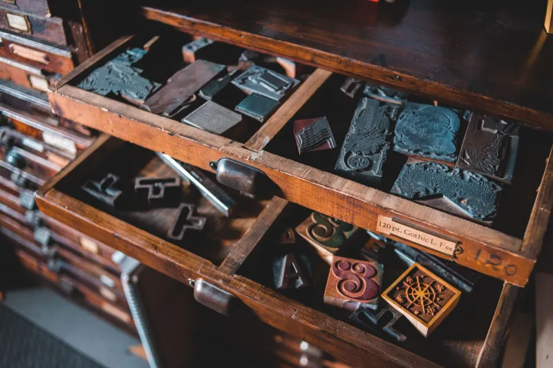
For American printers in the colonial and early Federal periods, the ampersand wasn't a shorthand quirk — it was a legitimate typographic character with a seat at the table. Early American print shops stocked it alongside every other piece of moveable type. It appeared in legal documents, newspaper mastheads, and commercial signage with the full confidence of something that belonged there.
Then the education reformers arrived. Standardization became fashionable. Twenty-six was a cleaner number. The ampersand got reclassified as punctuation — technically a demotion — and the alphabet shrank to the tidy row we now sing to a tune borrowed from Mozart. Progress, apparently, has a body count.
Thorn: The Letter That Would Have Saved Us All from "Ye Olde"
If the ampersand's exile was bureaucratic, the thorn's was almost colonial. The thorn (Þ, þ) was a letter inherited from the Old English runic alphabet, and it did exactly one job with extraordinary efficiency: it represented the "th" sound. As in the, that, this, those, them — the most common words in the entire English language. One character, doing the work of two.
When the printing press arrived in England, German and Italian typesetters didn't have a thorn in their type cases. They substituted the closest-looking character they had: the letter Y. And just like that, "the" became "ye" in print, not because anyone was trying to sound fancy, but because the hardware didn't support the original glyph. Every "Ye Olde Pub" sign in America is, at its core, a monument to a supply chain failure from the 15th century.
The thorn limped along in handwritten documents for another century or two before effectively disappearing from common English use. It survived in Icelandic, which is why Icelandic still has a letter that looks like it wandered out of a heavy metal logo. American English, meanwhile, doubled down on the two-letter workaround and never looked back.
Contemporary lettering artist Mara Solís, based out of Philadelphia, has been incorporating the thorn into hand-drawn typographic pieces for the past three years. "It's not about being archaic," she told us. "It's about asking why we decided two letters were better than one. The thorn is more efficient. We just forgot it existed."
The Yogh, the Eth, and the Others Whose Names You Can't Pronounce
The thorn wasn't alone in its exile. Middle English operated with a considerably larger toolkit than modern English does. The yogh (Ȝ, ȝ) represented sounds that don't have clean equivalents in the modern alphabet — a kind of guttural, approximant hybrid that got squeezed out as spelling conventions hardened. The eth (Ð, ð) handled a slightly different version of the "th" sound, distinguishing between the soft th in thin and the harder th in this. Linguistically, that's a meaningful distinction. Typographically, it was apparently too much to ask.
Then there's the long s — not technically a separate letter, but a distinct letterform (ſ) used in the medial and initial positions of words that persisted well into the American founding era. The U.S. Constitution was typeset with it. Ben Franklin used it. It looked like an f without the crossbar, which caused centuries of confusion for people encountering old documents and reading "Congreſs" as something unprintable.
Each of these characters represented a real phonetic or functional distinction. Their removal didn't make English simpler — it made English blunter. We compensated with digraphs, diacritics we mostly ignore, and a spelling system so inconsistent that it's become a kind of national personality trait.
What American Design Lost in the Trim
Here's where the story gets interesting for anyone who cares about visual culture. The 26-letter alphabet isn't just a linguistic tool — it's a design constraint. Every typeface, every logo, every signage system in America is built around the same 26 shapes. That's the entire canvas. When you subtract the characters that didn't make the cut, you also subtract the visual possibilities they carried.
The thorn has a vertical energy that no current Latin letter quite replicates. The yogh has a curvature that sits somewhere between a 3 and a z and belongs entirely to neither. The ampersand, even in exile, has remained so typographically rich that entire design careers have been built on its variations — which is arguably proof that it never should have been demoted in the first place.
Chicago-based type designer Kwame Asante has been working on a revival typeface that reintegrates several of these orphaned glyphs as fully functional characters. "I'm not trying to reform the English language," he said, with the tone of someone who has clarified this many times. "I'm asking what happens to letterform design when you give it more raw material. The answer is: a lot."
His project, currently in beta and circulating through a small community of experimental typographers, treats the thorn and eth as first-class citizens alongside the standard 26. The results look both ancient and genuinely futuristic — which is probably the correct aesthetic for letters that got cut before anyone alive today was born.
The Vote We Can Still Argue About
There's a version of American design culture in which the alphabet never got capped at 26. In which the thorn survived the printing press, the ampersand kept its seat, and the yogh found its way onto keyboards alongside Q and X. It's a parallel universe where spelling might actually make phonetic sense, where a few extra letterforms gave typographers additional raw material to work with, and where the phrase "Ye Olde" exists only as a punchline with proper historical context.
That universe didn't happen. But the characters it would have used still exist — in manuscripts, in Icelandic, in the studios of designers who find the official 26 a little too tidy.
At ABCDF∞, we've always suspected the alphabet was an incomplete sentence. Turns out we were right, and the missing words got evicted sometime around the 18th century. The good news is that eviction notices, historically, have a way of getting appealed.
The thorn is waiting. The ampersand never really left. And somewhere in a type designer's file folder, the yogh is getting a second audition.
About time.