Read the Wall: How Street Writers Invented a Typography America Was Too Scared to License
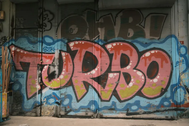
There is a wall in the Bronx that has been repainted seventeen times in the last decade. Not because the city loves it. Because the people who write on it keep coming back. The letters change. The names cycle. But the commitment to making something beautiful in a place that wasn't designed for beauty — that part stays constant.
Graffiti writing is, among many other things, a typographic practice. It is also illegal in most American cities, which has historically made it difficult for design schools to teach and for museums to exhibit without a certain amount of institutional hand-wringing. But strip away the legal debate and what you find underneath is one of the most sustained and inventive experiments in letterform design that this country has ever produced — built not in studios, but on trains, overpasses, and the sides of buildings that the people who owned them weren't paying enough attention to.
The Letters Come First
Ask a graffiti writer what they do and most of them will tell you, before anything else, that they write letters. Not words, exactly, though words matter. Letters. The individual forms, the way a capital A can be stretched into architecture, the way an S can become a whole argument about movement and tension.
"People think it's about the name," says Devo, a Philadelphia-based writer who has been active since the late 1990s and who agreed to speak on the condition that we use his tag rather than his legal name. "But the name is just the content. The letter is the design problem. How do I make this M do something nobody's made an M do before? That's the actual question."
This is not how typography is typically discussed in design programs, where the conversation tends to center on legibility, hierarchy, and the relationship between letterforms and the bodies of text they carry. Graffiti writing inverts that hierarchy almost completely. Legibility is optional — sometimes deliberately abandoned. What matters is presence, originality, and the ability to communicate something essential about the writer's visual identity in the time it takes someone to walk past a wall.
The Grammar Nobody Wrote Down
Every regional graffiti scene in America has developed its own visual dialect, and these dialects are as distinct and place-specific as spoken accents.
New York wildstyle — the interlocking, arrow-studded, aggressively complex letterforms that emerged from the subway era of the 1970s and '80s — looks nothing like the bubble letters that developed simultaneously in Los Angeles, which look nothing like the "cholo" script traditions of Chicano neighborhoods in East LA, which look nothing like the stencil-and-paste work that has defined West Coast political street art for thirty years. These are not variations on a theme. They are different typographic languages, each with its own internal logic, its own hierarchy of skill, and its own community of practitioners who can read them with the fluency of native speakers.
"When I look at a piece, I can usually tell what city it's from within a few seconds," says Tanya Reyes, a muralist based in Chicago who has spent the last decade documenting graffiti traditions across the Midwest. "There are regional signatures in the way people handle letterforms. The angles they favor. The way they treat negative space. It's like a visual accent."
What Reyes is describing is, in typographic terms, a tradition of vernacular design — letterforms that emerged from specific communities, specific materials, and specific constraints rather than from academic training or professional intention. Vernacular design has always been the uncomfortable stepchild of the design world, too interesting to ignore and too messy to fully embrace.
The Theft Problem
Here is where the conversation gets uncomfortable, and where it needs to go anyway.
The letterforms developed by graffiti writers — often at personal legal and physical risk, in communities that were being systematically divested by city governments — have been extracted, cleaned up, and sold back to mainstream culture with remarkable consistency and almost no attribution.
The "urban" and "street" fonts available on every stock site and type foundry in America did not emerge from nowhere. They are, in many cases, direct descendants of visual innovations made by writers who never received a design education and never saw a royalty check. Fashion brands, advertising agencies, and movie studios have built entire visual identities on aesthetic vocabularies borrowed from communities they had no other relationship with.
"They take the letters and leave out everything that made the letters mean something," says Devo. "The risk. The neighborhood. The reason somebody needed to put their name somewhere in the first place. You can't license that part."
What the Wall Is Actually Saying
Graffiti writing has never been only about aesthetics. The act of writing on a surface that belongs, nominally, to someone else is a statement about belonging — about who gets to mark space, whose presence is acknowledged, whose name gets to exist in public.
In neighborhoods where official signage, public art budgets, and architectural attention have historically been minimal, graffiti has served as a form of community cartography. These are our streets. These names live here. This visual language is ours.
"The city puts up a blank wall and calls it neutral," says Reyes. "It's not neutral. A blank wall in a disinvested neighborhood is a statement about who matters. When writers fill it, they're making a counter-statement. They're saying: we're here, we made something, and it's more interesting than what you left us with."
This is typography as political act — not in the abstract, theoretical sense that design critics like to invoke, but in the immediate, material sense of people asserting their presence in public space.
The Design World Is Finally Paying Attention (Sort Of)
There are encouraging signs that the relationship between graffiti culture and institutional design is becoming slightly less extractive. Museums including the Museum of Arts and Design in New York have mounted serious exhibitions on graffiti and street art. Some type foundries have begun commissioning letterforms from writers with direct roots in graffiti traditions, with actual credit and compensation.
But the fundamental tension remains. The thing that makes graffiti typography alive — its illegality, its site-specificity, its connection to communities that are not the design industry's primary audience — is exactly the thing that institutions struggle to preserve when they try to legitimize it.
You can put a wildstyle piece in a gallery. You cannot put the wall in a gallery. You cannot put the night it was painted, or the conversation that happened afterward, or the fact that the writer had to be somewhere else by morning.
At ABCDF∞, we believe that the most interesting typography is the kind that was made by people who weren't asked for permission. The wall has always known this. The rest of us are still catching up.