Clip, Paste, Detonate: The Outlaw Typography That Refused to Stay Criminal
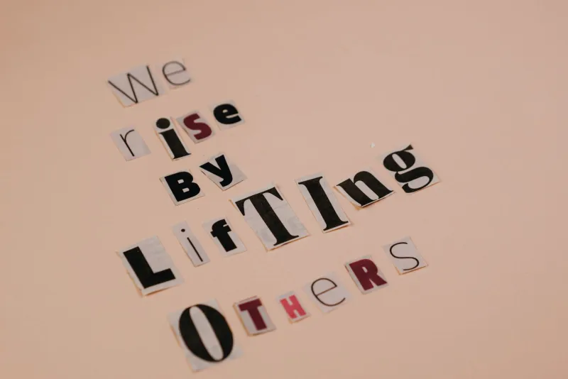
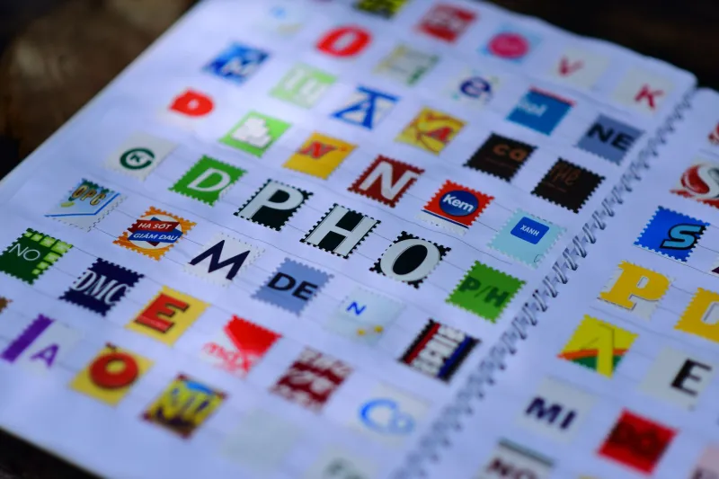
There is something deeply funny about the fact that one of America's most enduring graphic design traditions began as a way to avoid handwriting analysis. The ransom note — letters clipped from magazines, newspapers, cereal boxes, whatever was lying around — was a criminal's solution to a forensic problem. Keep your penmanship out of it. Let the alphabet speak for itself, in seventeen different voices, at seventeen different sizes, across a single terrifying sentence.
And then the artists got hold of it. As they always do.
The Scissors Were Always Political
Long before anyone called it "collage typography" or gave it a gallery wall, the cut-and-paste letter format was doing something structurally radical. It took ownership of language away from institutions. Newspapers, magazines, corporate ad copy — these were the sources. To clip from them and reassemble their letters into something new was, whether the maker knew it or not, a form of détournement. You were hijacking the machinery of mass communication and pointing it somewhere else entirely.
The Dadaists understood this in the 1910s and 1920s, chopping up text with almost violent glee. But it was American punk culture of the mid-1970s that democratized the gesture completely. You didn't need an art school education or a Letraset catalog. You needed a magazine, a pair of scissors, a glue stick, and something to say. Zines like Sniffin' Glue in the UK and their countless American cousins — xeroxed, stapled, distributed out of record store back rooms in New York, Los Angeles, and every mid-sized city with a rehearsal space — turned ransom-note typography into the visual grammar of dissent.
The mismatched letterforms weren't a bug. They were the entire point. Inconsistency was the message. No single corporate voice. No unified brand. Just raw, plural, slightly unhinged communication that looked like it had been assembled under pressure, because it had.
From FBI Files to Record Sleeves
By the late 1970s and into the 1980s, the aesthetic had migrated from stapled zines to album art, protest posters, and fashion. Malcolm McLaren and Vivienne Westwood were deploying it in London. American hardcore bands were plastering it across show flyers photocopied at Kinko's for eleven cents a sheet. The Sex Pistols' ransom-note album aesthetic crossed the Atlantic and merged with a homegrown tradition of agitprop visual culture stretching back through the civil rights movement and further.
What's worth noting — and what design history sometimes glosses over — is how much of this work was being made by people with no formal design training whatsoever. The cut-up letter format was one of the few visual languages that rewarded inexperience. Awkwardness was authenticity. The wobblier the baseline, the more you trusted it.
Collectors now pay serious money for original punk flyers and zine covers featuring this aesthetic. The Smithsonian has archived examples. What was once literally garbage — a photocopy of a photocopy, handed out free at a show — has become a document of American visual culture. The alphabet, scrambled and stolen, turned out to be worth something after all.
The Adobe Problem
Here is where things get genuinely complicated, and where ABCDF∞ — a platform built on the premise that letters can be unbound and art can be undefined — has to sit with a little productive discomfort.
Digital tools have made the ransom note aesthetic almost embarrassingly easy to replicate. There are fonts designed to look like clipped letters. There are Photoshop brushes that simulate torn paper edges. Instagram filters that add a xerox grain. Canva templates — Canva templates — that will generate something resembling a 1977 punk zine in about forty-five seconds, ready to promote your artisanal hot sauce brand or announce a wellness retreat in Sedona.
This is not a new problem. Every subversive visual language eventually gets absorbed. Grunge typography went from David Carson's experimental Ray Gun magazine layouts in the early 1990s to being used to sell cargo shorts at the mall within a decade. The skull-and-crossbones ended up on children's backpacks. The question isn't whether co-optation happens — it always does — but whether the original charge survives somewhere underneath the pastiche.
The Analog Revivalists
The answer, it turns out, is yes. But you have to look for it.
Across the US, a loose network of artists and designers are working with actual physical cut-and-paste methods — not as nostalgia, but as a deliberate rejection of the smoothness of digital production. Artists like Brooklyn-based zine maker Tara Booth and Los Angeles collage artist Jaime Muñoz (who works under the name Cortado) are producing work that insists on the handmade trace. The slight misalignment. The shadow where the glue dried unevenly. The letter that came from a TV Guide from 1994 and carries the ghost of that context with it.
This is the thing that filters can't fake, not really: provenance. When you clip a letter from a physical object, you are bringing that object's history into the composition. A capital G from a Time magazine cover from 1987 is a different G than one from a fast food menu or a church bulletin. The ransom note aesthetic, at its most rigorous, is a form of found-object archaeology. Every letter is a shard.
Contemporary protest movements have also kept the form alive in its most urgent register. Handmade signs at demonstrations — many of which deliberately employ the mismatched, multi-source letterform aesthetic — carry a visual weight that a printed banner simply doesn't. The suggestion of urgency. The implication that this was assembled from whatever was available because there wasn't time for anything else. Whether or not that's literally true, the aesthetic communicates it.
What the Scrambled Alphabet Still Knows
The ransom note format survives, and probably always will, because it encodes something true about how language actually works. Meaning is not unified. Communication is not smooth. Words arrive from multiple sources, carrying multiple histories, and the pretense that they can be assembled into a clean, consistent, brand-approved voice is exactly that — a pretense.
The clipped letter, pasted at a slight angle, in a point size that doesn't quite match its neighbors, is just being honest about that.
At ABCDF∞, we've always believed the alphabet is wilder than it looks. Twenty-six letters, infinite configurations, and somewhere in the space between them, a pair of scissors is still moving. The ransom note never really left. It just keeps changing what it's demanding.
And we keep paying attention.