These Designers Are Smuggling Human Handwriting Back Onto the Internet and It's Working
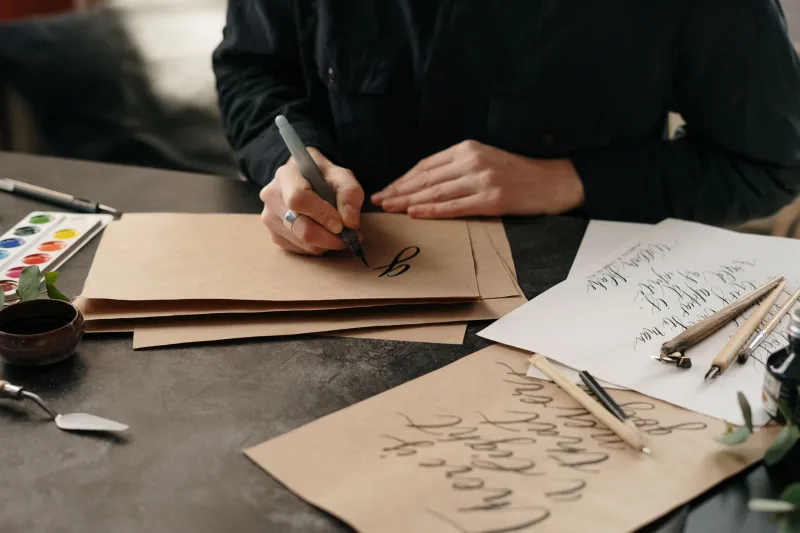
There is a specific kind of horror that arrives when you realize your handwriting has gotten worse since you stopped using it. Not just a little worse — paleontologically worse, as though your hand forgot what a lowercase cursive E looks like and decided to wing it. You are not alone. America's collective penmanship has been in freefall for roughly two decades, and autocorrect has been standing at the bottom of the cliff handing out participation trophies.
Which makes it all the more interesting that a growing number of digital designers are doing the exact opposite: dragging their handwriting, imperfections and all, directly into websites, social media campaigns, and brand identities. Not as decoration. As a statement.
The Tyranny of the Perfect Glyph
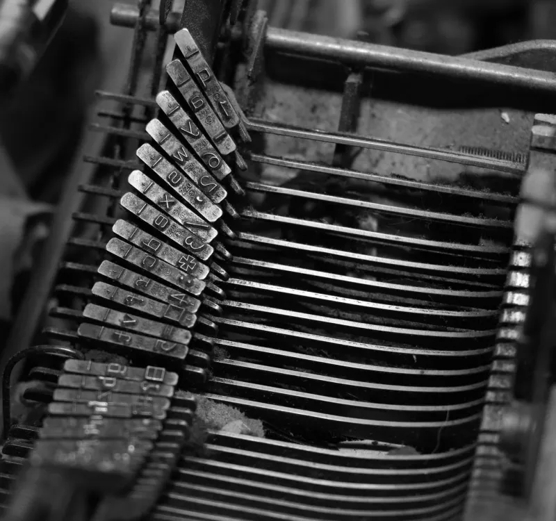
To understand the rebellion, you have to understand what it's rebelling against. Modern digital typography is, by definition, standardized. Every instance of the letter A in Helvetica is identical to every other instance. Every period lands in exactly the same place. This consistency is a technical achievement of genuine beauty — the kind of thing that would have seemed miraculous to a 15th-century printer.
It is also, after enough exposure, completely soulless.
Algorithmic platforms have compounded this by optimizing for legibility, shareability, and speed — all values that favor clean, system-native fonts over anything that looks like it came from a human hand. The result is a visual internet that increasingly resembles a very well-organized filing cabinet. Functional. Sterile. Impossible to love.
"There's a particular font that Instagram's algorithm seems to prefer for readability in Stories," says Camille, a brand designer based in Austin who has been working exclusively with hand-lettered assets for the past three years. "Once you notice it, you see it everywhere. Every small business, every wellness brand, every 'authentic' artisan product. The same font. Performing authenticity in perfect unison."
The Scanner as a Radical Tool
The handwriting insurgency operates on a surprisingly simple technical premise: write something by hand, scan it at high resolution, clean it up just enough to be legible, and deploy it as a design asset. The process is deliberately inefficient. That inefficiency is the point.
In Seattle, a collective of web designers called Smudge & Serif (they asked that their real names not be used, citing what one member described as "professional consequences from people who take Figma very seriously") has built an entire web design practice around scanned handwriting. Their client sites use hand-drawn navigation menus, handwritten body copy for key sections, and — their signature move — a different hand-drawn version of the site's name on every page load.
"It's not random," explains one collective member. "We write it fresh each time a new client approves the design. So the handwriting is genuinely different each time because it was written in a different mood, on a different day. The site has a memory of when it was made."
This is either deeply poetic or wildly impractical, depending on your relationship with version control.
Calligraphy as Civil Disobedience
Beyond aesthetics, some practitioners frame the handwriting movement in explicitly political terms. In an era when large language models can generate infinite volumes of text, and AI image tools can produce unlimited visual content, the human hand leaves a mark that cannot be perfectly replicated or infinitely scaled. It is, in a meaningful sense, the last unfakeable thing.
"When everything can be generated, the generated thing becomes worthless," argues Marcus, a lettering artist and activist based in Philadelphia who has been wheat-pasting hand-lettered posters around the city for years and recently extended the practice to digital spaces by posting only scanned originals. "My handwriting is evidence that I exist. That I held a pen. That there was friction."
This framing resonates with a particular slice of American design culture that has grown suspicious of seamlessness — the aesthetic quality that used to signal quality and now increasingly signals automation. Rough edges, ink bleed, inconsistent letterforms, the ghost of a correction: these are now markers of the real.
The Brands That Got There First
Predictably, the moment a subcultural aesthetic develops genuine credibility, brands start trying to borrow it. Several American consumer companies have launched campaigns featuring what they describe as "handcrafted" lettering — which, upon inspection, turns out to be a commercial font designed to look handwritten, with algorithmic variation built in to simulate inconsistency.
The practitioners of the actual handwriting movement are not amused.
"There are entire font families now that are just handwriting cosplay," says Camille, with the particular exhaustion of someone who has explained this distinction many times. "The algorithm learned that handwriting reads as authentic, so it produced a product that mimics handwriting. Which means you now need actual handwriting to signal authenticity, because the fake version is everywhere."
This is the accelerating loop at the center of the movement: authenticity gets commodified, which raises the bar for what counts as authentic, which drives practitioners toward even more unmediated, even more effortful, even more genuinely human marks. At some point, the logical conclusion is a website that is literally just a photograph of a handwritten note. Several people are already doing this. It looks great.
Learning to Write Again
Perhaps the most unexpected side effect of the handwriting rebellion is that it's sending designers back to basics — specifically, to the physical act of writing, which many of them had largely abandoned. Penmanship workshops in cities like Chicago, Brooklyn, and Los Angeles are reporting surging enrollment from people who identify primarily as digital creatives. Calligraphy supply shops, a category of retail that seemed to be on a glide path toward extinction, are experiencing something that looks uncomfortably like a renaissance.
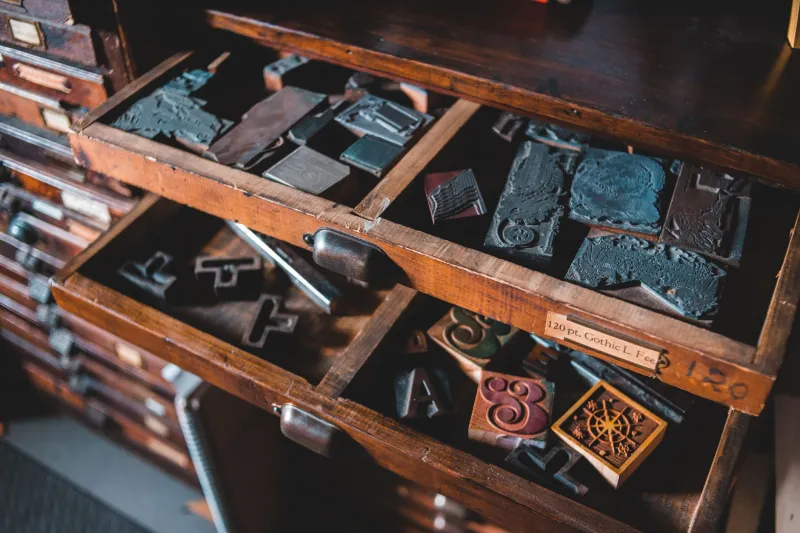
For ABCDF∞, a platform built on the premise that letters are anything but neutral, this feels like a natural homecoming. The alphabet was always physical before it was digital — pressed into clay, scratched into stone, dragged across paper by a hand connected to a body connected to a specific human life at a specific moment in time.
Autocorrect never understood any of that. The good news is that the hand remembers, even when it's gotten a little rusty. Give it a pen and something worth saying, and it'll figure out the rest.