Read This If You Can: The Designers Who Made Legibility the Enemy
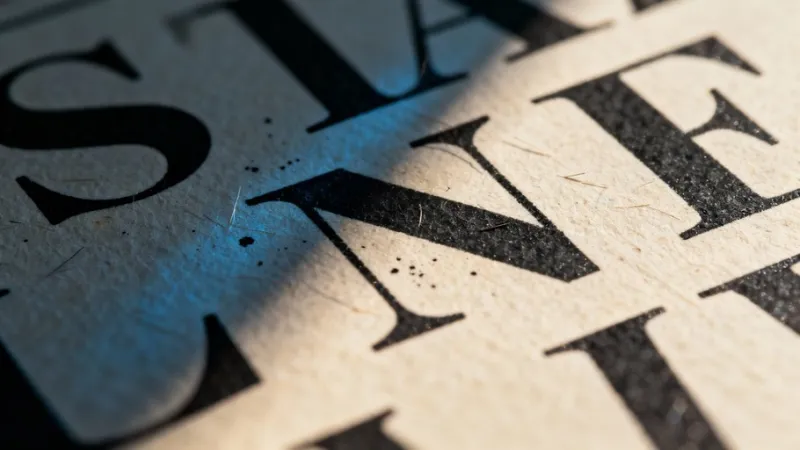
Photo: experimental typography abstract illegible letterforms art print close up, via images.stockcake.com
The first rule of typography, according to every design school that has ever existed, is that type should be readable. It should communicate. It should get out of the way of meaning and let the words do their job like a good, obedient visual servant.
Some designers have decided this is boring. Some have decided it's worse than boring—that legibility is a kind of tyranny. And so they've built fonts that fight back.
A Typeface That Doesn't Want to Be Read
Picture a letterform so distorted it takes your brain three full seconds to decode a single character. Serifs that mutate into tentacles. Counters—the enclosed spaces inside letters like "o" and "p"—that collapse inward like dying stars. Baselines that drift. Kerning that seems to have been set by someone who was actively angry at the concept of kerning.
This is the intentional illegibility movement, and it is thriving in the corners of contemporary design where people have stopped asking "can you read this?" and started asking "does it matter if you can?"
The answer, for a growing number of experimental designers and typographers, is a very considered no.
The Argument Against Reading
To understand why anyone would deliberately make something harder to read, you have to first accept that communication and meaning are not the same thing. A typeface communicates even when—especially when—you can't decode the words inside it. The texture of unreadable text creates a feeling. A mood. An experience that legible text, by definition, bypasses entirely because you're too busy reading.
Think about the last time you saw a piece of graffiti you couldn't quite parse. The letters bent and layered and interlocked until the word became more of an object than a message. You didn't read it. You encountered it. There's a difference, and experimental designers are extremely interested in that difference.
The illegibility movement draws from that same well. It's influenced by Dadaism (which famously didn't care what you thought), by the visual noise of early punk zines, by the deliberately abrasive aesthetics of industrial and black metal album artwork, and by a general philosophical suspicion of anything that's too easy to consume.
Making It Hard Is Making It Stick
Here's the paradox that sits at the center of this whole enterprise: the harder something is to read, the longer you look at it. Readable text gets processed and discarded. Unreadable text gets examined. Your brain, confronted with a letterform it can't immediately categorize, shifts into a different mode. You're no longer a passive reader. You're an active decoder. You're doing work.
And work, it turns out, creates memory. The cognitive effort required to wrestle meaning from an illegible typeface makes that meaning—when you finally arrive at it—feel earned. Significant. Worth keeping.
This is not an accident. Designers working in this space are deeply aware of what they're doing to the viewer's attention. They're not being sloppy or provocative for the sake of provocation. They're engineering a specific kind of encounter between the human eye and the letterform, one that readability would completely short-circuit.
ABCDF∞ and the Infinite Letter
At a site whose very name extends past the accepted boundary of the alphabet into infinity, we have a particular affection for this kind of thinking. The alphabet, as we've always maintained, is a starting point. What happens when designers treat individual letterforms the same way—as starting points for something stranger, denser, and more resistant?
You get typefaces that feel like architecture you can't enter. You get logotypes that function as visual puzzles. You get lettering systems that communicate exclusivity, danger, depth, or chaos before a single word is consciously registered by the reader.
Some of the most interesting work in this space is happening in album art, in streetwear branding, and in the kind of small-run art publications that still get printed on risograph machines in someone's basement in Brooklyn or Portland or whatever mid-size city currently has the best basement-to-art-publication ratio.
Readability as Class Marker
There's also a political dimension here that's worth naming. "Readable" design has historically meant design that serves the broadest possible audience—which sounds democratic but often functions as a way of enforcing mainstream aesthetic values and erasing the visual cultures of communities that developed their own letterforms outside institutional sanction.
When a designer chooses illegibility, they're sometimes making a statement about who their work is for. A typeface that rewards familiarity with a specific subculture creates an in-group. It says: if you can read this, you're already inside. If you can't, maybe that's fine. Not everything needs to be accessible to everyone. That's a controversial position in design circles, and it should be—but it's a position worth understanding.
The illegibility movement isn't monolithic. Some of its practitioners are purely formalist, interested in letterforms as sculptural objects. Some are cultural provocateurs. Some are just incredibly tired of Helvetica.
The Letter as Object
What all of them share is a willingness to treat the letter as an end in itself rather than a transparent vessel for meaning. When a character becomes so distorted that it stops being a carrier of language and starts being a thing—a shape, a texture, a presence—something interesting happens to the relationship between the viewer and the page.
You stop reading. You start looking. And looking, it turns out, is something we've been getting worse at for years.
Maybe the designers who make fonts you can't read are just trying to slow you down. Make you stay. Make you work for it.
Considering how fast everything else moves, that seems almost generous.