Q, X, and Z Walk Into a Bar: The Alphabetic Underdogs Running American Culture
If the alphabet were a high school cafeteria, E, T, and A would be sitting at the popular table, running student council, and getting quoted in the yearbook. Q, X, and Z? They'd be in the corner booth, wearing leather jackets, not saying much — and somehow everyone would be sneaking glances at them anyway.
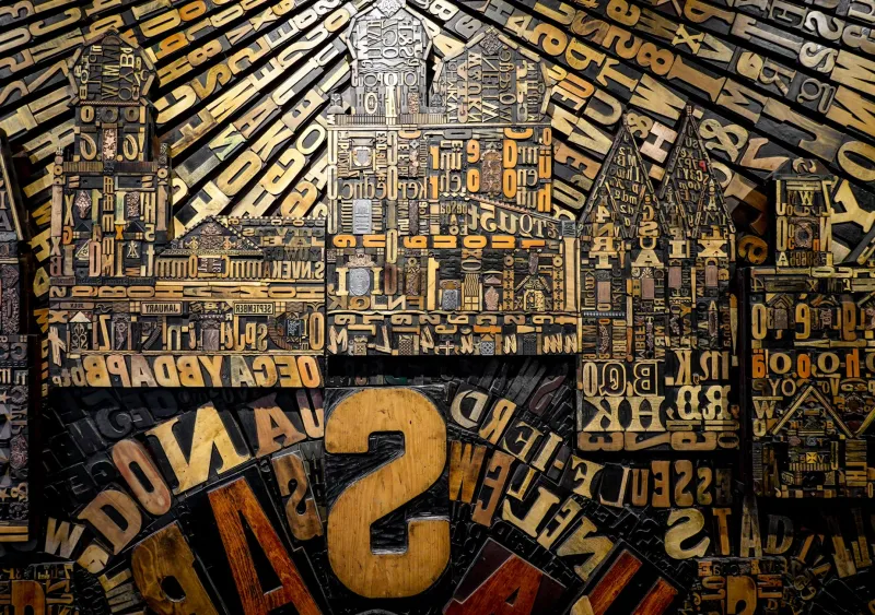
Welcome to the paradox of the rare letter: the less it appears, the more cultural weight it carries. Here at ABCDF∞, where we've literally built our identity around the idea that letters don't have to play by the rules (notice anything missing from our name?), we've been obsessing over this question for a while. Why do the alphabetic underdogs — Q, X, and Z — punch so far above their statistical weight in American pop culture?
Let's find out.
By the Numbers: These Letters Are Statistically Invisible
Linguists have been counting letter frequencies in English text for over a century, and the results are pretty humbling for our three protagonists. In standard written American English, the letter E appears roughly 13% of the time. Z? About 0.07%. Q clocks in at around 0.10%, and X manages a modest 0.15%.
To put that in perspective: if you wrote a 10,000-word article, you'd expect around 1,300 E's and maybe seven Z's. Seven. That's fewer Z's than there are Fast & Furious movies.
And yet — and here's where it gets weird — these three letters dominate the visual and cultural landscape in ways that E, T, and A could only dream about.
X Marks Everything Cool
Let's start with X, the overachiever of the group. The letter X has been doing heavy lifting in American culture since at least the mid-20th century. Malcolm X reclaimed it as a symbol of erased identity. Generation X used it to define an entire demographic's existential shrug. The X-Men turned it into a shorthand for otherness, mutation, and radical potential — which, honestly, tracks.
Then there's the brand universe. Xerox. Xbox. SpaceX. X (formerly Twitter, in case you've been living off the grid). The letter X signals technology, the unknown, the cutting edge — all from a character that shows up in everyday English text about as often as a solar eclipse.
"X is doing the work of a full marketing department," says typographer and lettering artist Dana Choi, who runs a Brooklyn-based studio specializing in experimental type. "It's got angularity, symmetry, and this inherent sense of danger. Put an X on something and it instantly feels like it shouldn't exist — in the best possible way."
She's not wrong. X has become American shorthand for anything that exists outside the normal parameters. Extreme sports. X-rated content. X as an algebraic unknown. The letter itself means mystery, and brands have been cashing that check for decades.
Z: From Zorro to Gen Z to Absolute Chaos
Z has had a stranger journey. For most of the 20th century, it was the sleepy final letter — literally used as a symbol for snoring in comic strips. Then something shifted.
In the 1990s, brands started replacing S's with Z's as a way to signal attitude. Kidz Bop. Boyz II Men. Your local pizza chain with an inexplicable Z at the end. It was a little embarrassing, honestly, but it worked. Z implied energy, youth, and a mild contempt for conventional spelling.
Then Generation Z came along and claimed the letter wholesale, and suddenly Z was serious again. TikTok, the cultural engine of Gen Z, is a platform built on brevity and speed — and Z, the last letter, the finish line, the final frontier, became its spiritual mascot.
In experimental art circles, Z carries a different kind of weight. Conceptual artist Marcus Webb, whose ongoing project Zebra Zephyr Zero consists entirely of Z-initial words arranged in shifting visual grids, describes the letter as "the sound of something ending that refuses to end."
"Z is the alphabet saying goodbye," Webb told us over email, "but it's a goodbye that echoes. It buzzes. It doesn't just stop."
Q: The Loner With a Bodyguard
Poor Q. Of the three, Q gets the least respect, possibly because it almost never appears without its sidekick U. QU is one of English's most codependent letter relationships — a coupling so consistent that when Q appears without U (in words like qigong or Qatar), it feels genuinely transgressive.
But Q's rarity is precisely what makes it magnetic. In branding, Q signals quality — literally, it's the first letter of the word. QDOBA. Qantas. Q-tip. The character Q in James Bond films is the smartest person in the room and barely has a name. Just a letter. That's power.
In hip-hop, Q has had a quietly legendary run. Q-Tip. QC Records. ScHoolboy Q. The letter carries a cool-kid energy that's hard to quantify but impossible to ignore.
Typographer Renata Flores, who teaches experimental lettering at the Rhode Island School of Design, argues that Q's visual form is part of its mystique. "It's a circle with a tail," she explains. "Every other letter is trying to be efficient. Q looks like it wandered in from a different system entirely. It's the most alien-looking letter in the Latin alphabet, and that's why designers love it."
Scarcity as Creative Currency
What Q, X, and Z share — beyond their statistical obscurity — is the cultural logic of scarcity. In economics, rare things accrue value. In semiotics, unusual signs attract attention. In American pop culture, the letters that don't show up every five seconds in a grocery list are the ones that feel special, edgy, and worth noticing.
This is something the experimental art community has understood for years. At ABCDF∞, we've covered artists building entire visual languages from scratch, and many of them gravitate toward underused characters as a way to destabilize the familiar. When you strip away the common letters, the rare ones become load-bearing walls.
"Working with Q, X, and Z forces you to slow down," says Webb. "You can't coast on familiarity. Every word becomes a small act of resistance."
The Infinite Comeback
Here's the thing about alphabetic underdogs: they don't stay down. Z was a punchline in the '90s and a generational identity by the 2020s. X went from a placeholder for the unknown to the name of a multi-billion-dollar company. Q is quietly colonizing every industry that wants to sound premium without trying too hard.
At ABCDF∞ — a name that skips a few letters and then opens into infinity — we find this deeply, genuinely exciting. The alphabet isn't a fixed hierarchy. It's a living system, and the letters at the bottom of the frequency chart are staging a permanent, low-key revolution.
Next time you see a brand logo with an X in it, or a musician who goes by a single letter, or an art installation built entirely around the letter Z — know that you're watching scarcity do what it always does.
Make something ordinary feel like it was never meant to be contained.