Ink and Identity: One Font for Every Letter of America's Visual Soul
Ink and Identity: One Font for Every Letter of America's Visual Soul
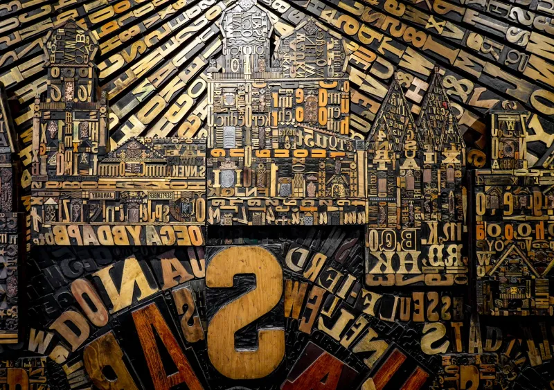
Here at ABCDF∞, we believe letters are never innocent. Every curve, every serif, every aggressively condensed sans-sans screams something about who made it, who used it, and what they were trying to get away with. Typography is America's secret autobiography—written in kerning and leading instead of words.
So we did the only logical thing: we assigned one defining American typeface to each of the 26 letters of our beloved, finite, suspiciously corporate alphabet. Buckle up. This is going to get opinionated.
A is for Akzidenz-Grotesk — The Blueprint Nobody Credits
Before Helvetica stole the spotlight, Akzidenz-Grotesk was quietly influencing every mid-century modernist who wanted to look European and serious. American corporations adopted its descendants wholesale. It is the uncredited grandfather of half the logos on your credit cards.
B is for Bodoni — The Diva of Fashion Magazines
Thin strokes. Thick strokes. Absolutely zero compromise. Bodoni showed up on Vogue covers and never left. It communicates luxury the way a velvet rope communicates that you are probably not getting in.
C is for Cooper Black — The Jolly Giant
Round, fat, and somehow always cheerful, Cooper Black is the typographic equivalent of a county fair. It appeared on record sleeves in the 1970s, on surf shop awnings, and—most famously—on the Easyjet logo, though Americans mostly remember it from their local pizza parlor's menu.
D is for DIN — The Highway's Own Voice
American road signage owes a debt to DIN that it has never formally acknowledged. Designed for German industrial standards, DIN became the backbone of clear, no-nonsense directional communication. Every time you read an exit sign doing 75 mph, you're reading DIN. You're welcome, and please keep your eyes on the road.
E is for Eurostile — The Future That Got Stuck in 1968
Eurostile promised us jetpacks and lunar condos. It appeared on NASA documents, science fiction paperbacks, and tech brochures that aged like warm milk. We still use it when we want something to feel futuristic in the way that 1968 imagined the future—boxy, optimistic, and slightly naive.
F is for Franklin Gothic — The Protest Sign's Best Friend
Bold, wide, and completely unwilling to be ignored, Franklin Gothic has been the typeface of American dissent since the early twentieth century. Suffragette banners. Labor union flyers. Black Lives Matter posters. When Americans need to be heard, Franklin Gothic does the shouting.
G is for Garamond — The Quietly Radical Classic
Garamond is what happens when elegance refuses to apologize. It has appeared in more American literary novels than any font deserves, and it remains the passive-aggressive choice of every designer who wants to say I have taste without actually saying anything.
H is for Helvetica — The Unavoidable
Of course it's here. Helvetica is on the New York City subway, the American Apparel logo (RIP), the IRS website, and approximately 40% of all corporate rebrands since 1960. Helvetica is the beige wall of typography: inoffensive, everywhere, and somehow still debated endlessly in design school.
I is for Impact — The Internet's Id
Before memes had a vocabulary, Impact gave them a voice. White text. Black outline. Rage, irony, or a picture of a cat. Impact is the typeface of the unfiltered American internet, and no amount of rebranding will ever fully launder its reputation.
J is for Johnston — The Transit Aesthetic Americans Borrowed and Never Returned
Originally designed for the London Underground, Johnston's clean humanist letterforms crossed the Atlantic and influenced generations of American transit and public design. We absorbed it, remixed it, and called it ours. Classic.
K is for Knockout — The Fighter's Font
Designed by Hoefler & Co., Knockout was built for the condensed brutality of sports headlines. It lives in ESPN graphics, boxing posters, and every small-town newspaper that needed to scream a score across a front page. It does not apologize for taking up space.
L is for Letter Gothic — The Typewriter's Ghost
Monospaced and mechanical, Letter Gothic haunts every screenplay format, government memo, and mid-century thriller novel cover. It is the sound of a typewriter in an empty office—efficient, slightly paranoid, and deeply American.
M is for Mrs Eaves — The Romantic Revisionist
A revival of Baskerville with softer proportions and a genuinely interesting backstory (Mrs. Eaves was John Baskerville's housekeeper and eventual wife—complicated!), this font became the darling of indie publishers, wedding invitations, and artisanal coffee shop menus across the US in the 2000s.
N is for News Gothic — The Paper of Record
The New York Times didn't build its reputation on Times New Roman alone. News Gothic and its relatives gave American newspaper design its authoritative, no-nonsense voice. It is the font of record, of record, of record.
O is for Optima — The Memorial
The Vietnam Veterans Memorial in Washington, D.C. is carved in Optima. That fact alone earns it a permanent place in American visual culture. It is elegant without being decorative—a font that understands the weight of what it carries.
P is for Playbill — The Wild West in Letterform
Slab serifs and showmanship. Playbill is the typeface of the circus poster, the saloon sign, and every Americana aesthetic mood board on Pinterest. It is nostalgia rendered in ink.
Q is for Quaint Gothics (Broadly) — The Vernacular Tradition
America's hand-painted sign traditions, from barbershop windows to diner menus, produced a sprawling family of informal gothic letterforms that no single typeface can fully capture. They are the fonts that never got digitized, and they are irreplaceable.
R is for Rockwell — The Slab That Sells
Robust, trustworthy, and built like a pickup truck, Rockwell has appeared in American advertising since the 1930s. It is the font equivalent of a firm handshake.
S is for Souvenir — The 1970s You Can't Escape
Soft, rounded, and aggressively groovy, Souvenir is the typographic artifact of an entire decade. It appeared on everything from album covers to fast food packaging, and it remains the most reliable way to make a designer physically wince.
T is for Trade Gothic — The Workhouse
Understated and reliable, Trade Gothic is the font that shows up, does the job, and doesn't demand a thank-you. It is on more American editorial pages than it will ever receive credit for.
U is for United States Signage Standards (Highway Gothic) — The Road Itself
Developed specifically for American highways, Highway Gothic is the font of motion, distance, and the open road. It is as American as the interstate system it was designed to label.
V is for Verdana — The Screen's First Compromise
Designed for readability on low-resolution monitors in 1996, Verdana shaped how an entire generation of Americans read online. It is not glamorous. It is essential.
W is for Wim Crouwel's Grid Fonts — The Nerd Imports
American design schools worshipped Dutch modernism, and Crouwel's radical grid-based letterforms filtered into US experimental typography throughout the late twentieth century. Influence doesn't always come with a byline.
X is for Xerox's Legacy Fonts — The Office in Letterform
The fonts that shipped with photocopiers and early office software defined how millions of Americans encountered typography for the first time. Unremarkable by design. Formative by accident.
Y is for You (Comic Sans) — The People's Typeface
Designed in 1994 and immediately beloved by every school newsletter, bake sale flyer, and passive-aggressive office note in America, Comic Sans is the most democratically used font in history. Designers hate it. The people have spoken.
Z is for Zuzana Licko's Digital Innovations — The Future Arrived Early
Co-founder of Emigre magazine and type foundry, Licko designed fonts for the pixelated reality of early Macintosh screens and in doing so rewrote what American digital typography could look like. She did it before anyone else admitted it needed doing.
The alphabet has 26 letters. America has had about 250 years to fill them with meaning. Typography is how that meaning gets transmitted—silently, persistently, and almost never neutrally. At ABCDF∞, we think that's worth paying attention to. Even if the font you're reading this in is, statistically, Helvetica.