Letters Seen Sideways: How Dyslexic Artists Are Designing the Alphabet Out of Its Own Rules
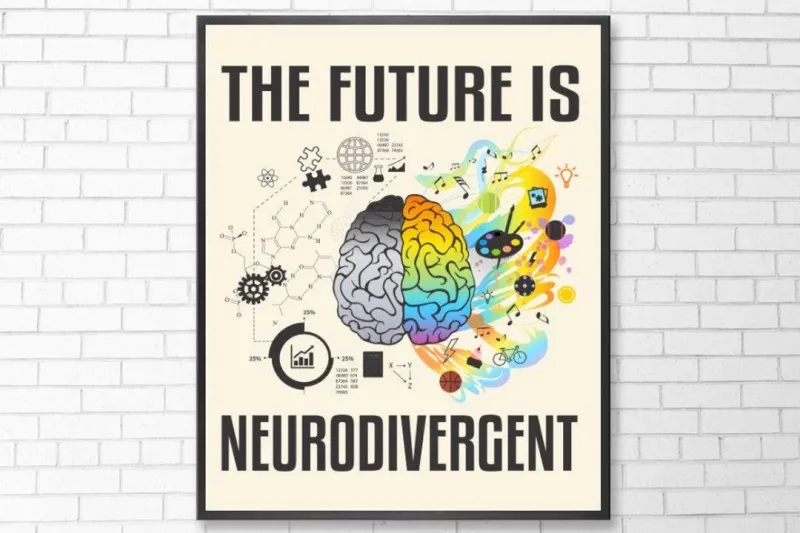
Photo: abstract letterforms typography neurodivergent art studio creative, via i.etsystatic.com
The first time Caleb Morrow tried to describe what reading felt like, he was nine years old and his teacher was not particularly interested in the answer. "I said the letters moved," he recalls, sitting in his Chicago studio surrounded by enormous canvases covered in fractured, layered letterforms. "She said they didn't. I said they did. We were both right, and neither of us knew it."
Morrow is now one of the more quietly celebrated typographic artists working in the American Midwest, with a practice built almost entirely around the visual phenomenon his teacher dismissed: letters that don't stay still. His dyslexia — diagnosed at age eleven, after two years of being described as "not trying hard enough" — turned out not to be a reading problem. It was, depending on your frame of reference, a design superpower that the educational system spent the better part of his childhood trying to switch off.
He was not alone in this experience. And increasingly, he is not alone in deciding to lean in.
The Tyranny of the Correct Letterform
Typography has, for most of its professional history, been a discipline obsessed with correctness. The rules are extensive, the terminology is dense, and the community's relationship to deviation ranges from "playful tolerance" to "genuine hostility," depending on whether you're at a design conference or a type forum at 2 a.m. Serifs are defended with the fervor of constitutional rights. Kerning errors cause physical discomfort in a measurable portion of the population.
In this context, dyslexia — which affects an estimated 15 to 20 percent of the American population and manifests in a huge variety of ways, from letter reversal to difficulty tracking lines to what some describe as letters that seem to rotate or vibrate on the page — has historically been framed as a problem to be corrected before you can participate in visual communication.
But a growing cohort of neurodivergent American artists and designers is flipping this entirely. If the alphabet looks different to your brain, they argue, that's not a malfunction. That's a perspective. And perspectives, in art, are the whole point.
Seeing in Three Dimensions When Everyone Else Sees in Two
Research on dyslexia has increasingly suggested that many dyslexic individuals process visual information differently in ways that extend beyond just reading difficulties. Studies from the University of Cambridge and several American institutions have found that dyslexic individuals often demonstrate stronger abilities in spatial reasoning, three-dimensional visualization, and peripheral pattern recognition.
For designers, these are not incidental skills. They are the job.
Rachel Fong, a Los Angeles-based illustrator and type designer who was diagnosed with dyslexia at age seven, describes her visual process in terms that would make most design schools quietly revise their curriculum. "I see letterforms in 360 degrees," she says. "When I look at a capital 'B,' I don't just see the front of it. I see it as an object that exists in space. I'm always thinking about what the back of it looks like, what it looks like from below."
This spatial relationship with letterforms has produced a body of work — dimensional type sculptures, letterforms that seem to exist at impossible angles, alphabets that appear to be in the process of turning around — that has landed her in three national design publications and a residency at the California Institute of the Arts. None of her professors, she notes dryly, initially understood what she was doing. "They kept asking me to flatten it," she says. "I kept asking why."
The Artists Who Stopped Apologizing
Caleb Morrow's canvases are worth lingering on. Each one takes a single word — sometimes a single letter — and renders it across a surface in multiple simultaneous states: the letter as it appears to him when his focus is sharp, when it drifts, when it reverses, when it doubles. The effect is not chaotic. It is, unexpectedly, deeply organized — a kind of visual phonetics that maps the experience of reading a letter across time rather than fixing it in a single moment.
"Every time I look at a word, I'm seeing it through a process," he explains. "My brain is doing work that other people's brains do invisibly. I just decided to show the work."
Across the country in Providence, Rhode Island, graphic designer and educator Tomás Rivera has taken a different approach. His studio, which he runs with his partner and which has produced branding work for a range of cultural organizations, operates on what he calls a "dyslexic design philosophy" — a set of principles derived from his own perceptual experience that prioritizes spatial breathing room, multiple reading paths, and what he describes as "tolerance for the letter in motion."
"Standard grid-based design assumes that the reader's eye moves in one direction at a predictable speed," he says. "My eye never did that. So I design for the eye that wanders, the eye that backtracks, the eye that takes the scenic route. And it turns out a lot of people find that more interesting to look at."
What the Alphabet Looks Like From the Other Side
There is a philosophical argument lurking inside all of this, and it is one that sits comfortably at the heart of what ABCDF∞ has always been doing: the alphabet is not a fixed thing. It is a human invention, maintained by consensus, and consensus has always excluded certain experiences by default.
When a dyslexic artist renders a 'd' and a 'b' as mirror twins — equally valid, equally beautiful, neither one "correct" — they are not making an error. They are making a statement about a system that decided, somewhat arbitrarily, that one orientation was right and the other was wrong. They are asking, politely but firmly, who made that call.
Dr. Angela Reyes, a disability studies scholar at NYU who has written about neurodivergence and creative practice, frames it this way: "We built an alphabet for a specific kind of brain, then told everyone else their brain was broken. The artists who are reclaiming that experience aren't just making interesting work. They're doing a kind of corrective justice."
Caleb Morrow doesn't use the word justice. He uses the word obvious. "Once I stopped trying to see letters the way I was told to see them, and started just drawing what I actually saw," he says, "the work got a lot better. It turns out the alphabet looks pretty incredible from the wrong angle."